
Empowering Moleskine’s smart notebook users to join a creative community through a strong onboarding process
ROLE
UX Research & UI Design
TIMELINE
From scratch to mobile onboarding:
2 Weeks
TEAM
5 UX/UI Designers
OUR TOOLBOX
Figma, Figjam, Figma make: Ideation and design
ClickUp: Project management and collaboration
We were tasked with creating a social media platform for moleskine’s smart notebook users
Moleskine Smart is a line of tools that includes a smart notebook, pen, and accompanying mobile app that enable you create freely on physical paper, and smoothly convert your work into digital form.
Screenshot from Moleskine’s Website
we found that creative Notebook users were missing a place to share their work with like-minded people
Our user interviews revealed that users are unfulfilled, uninspired, and hesitant to share their work.
They have tried to use existing social media to get feedback on their work or find others using journals for connection or inspiration, but have felt that these spaces cater more towards popularity fueled by algorithms, trolls on the internet, and keeping up fake appearances.
I’m motivated by sharing, but only when it feels intentional, optional, and human, not performative.
I’m looking for smaller, trusted communities where feedback is thoughtful, credible, and judgment-free.
On existing social media platforms, users lack control over
What and who they are exposed to
How they engage with others
The quality of their interactions
How might we foster environments in which creatives feel inspired and encouraged to share ideas without fear of hesitation?
How might we empower users to connect with like-minded people?
How might we inform the user enough for them to trust a social media site?
What are some spaces on the internet where people feel informed enough to trust the community they’re signing up for?
Keeping our How Might We questions in mind, we examined best practices:
Tumblr has served as a space where people can share their creativity, regardless of how niche their specialty is.
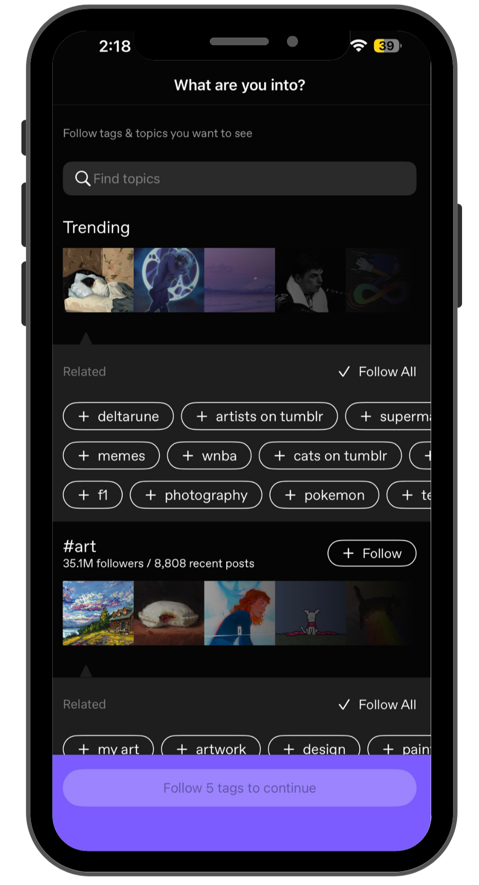
Their onboarding process asks the user to narrow down interests
and clearly shows how their selections would manifest on their feed.
Airbnb sets the tone with upfront community guidelines that users have to agree to before entering the vacation rental marketplace, which highlights what the company values.
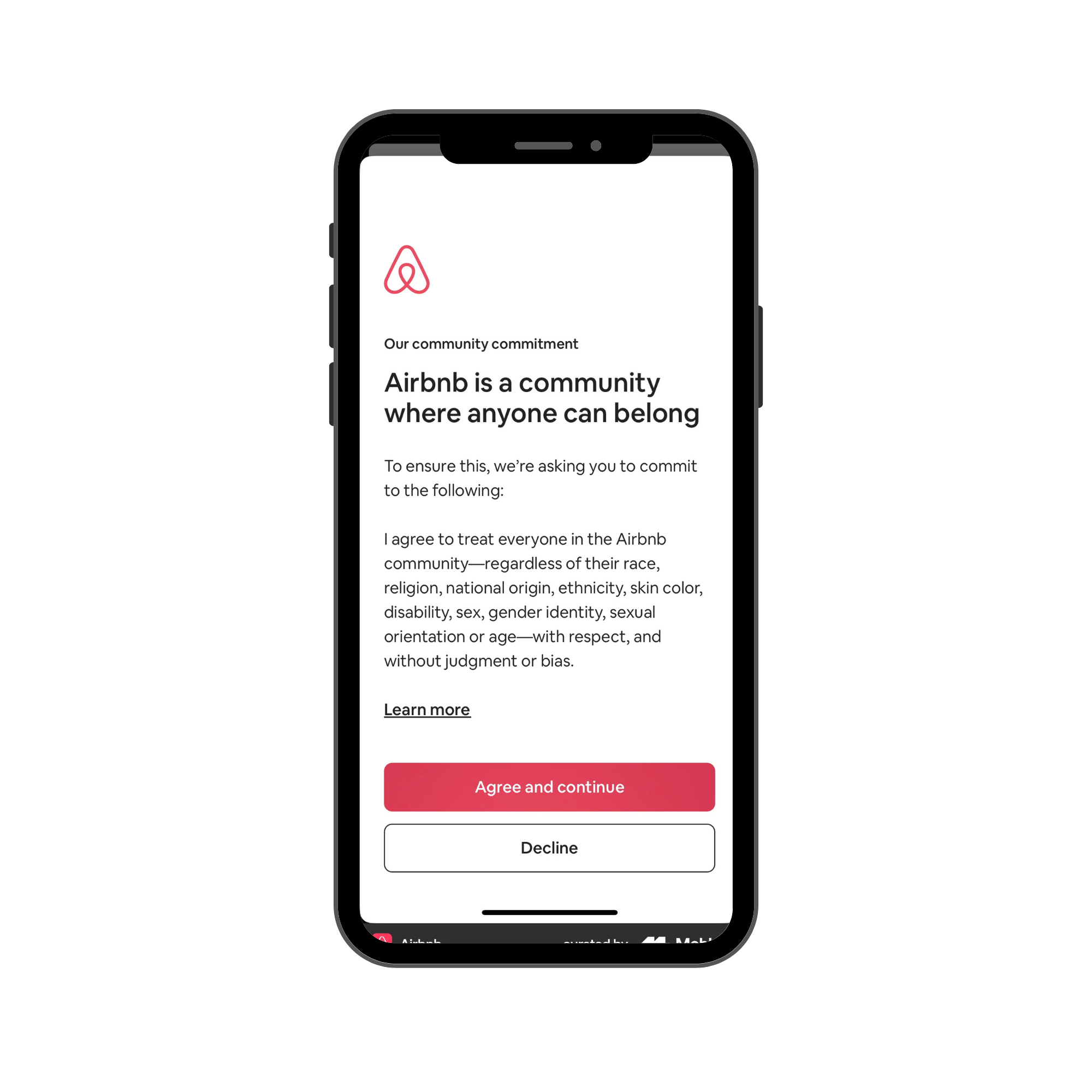
Community guidelines are on a dedicated screen, not bundled with other setup tasks.
Provides a “Learn more” link for users who want deeper context.
Pinterest is content-forward as opposed to being guided by user popularity
Allows for curation of feed by filtering interests
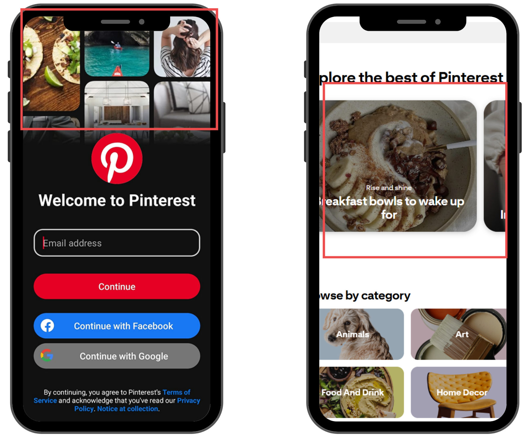
Their content cards show content only. then. when clicked into, shows the user who posting it.
Their sign-up page shows the user a snippet of what their feed will look like.
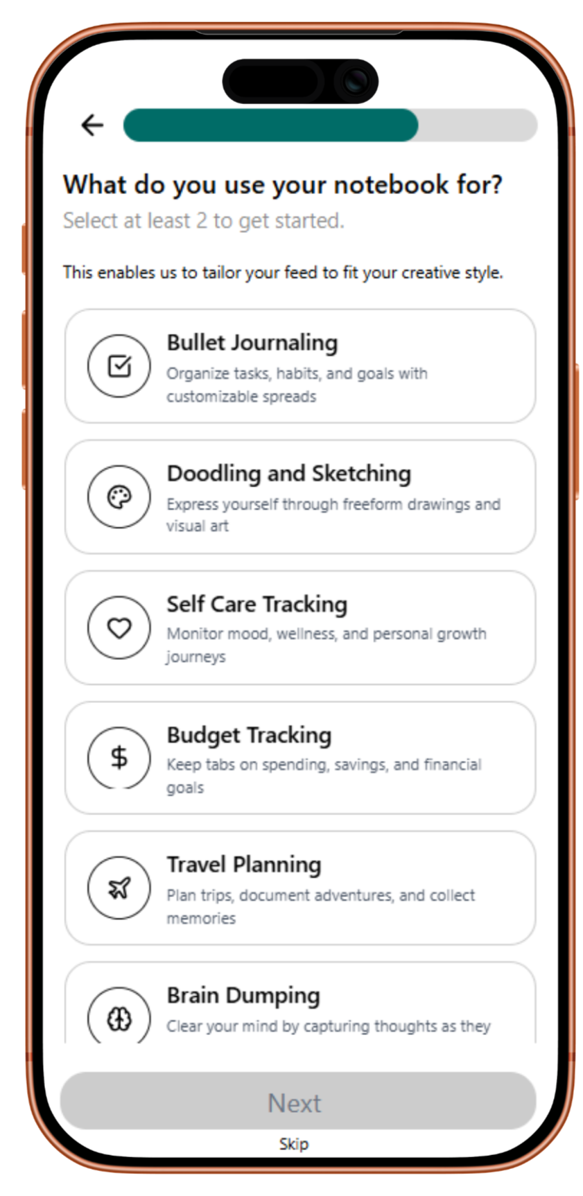
Keeping our hesitant users in mind, we decided that the task that needed the most consideration was the onboarding process
Our solution is Molehill Studio: an addition to the Moleskine Smart Writing Set App, which provides a social space for like-minded creatives to connect, inspire, and thrive.
A strong onboarding experience will allow creatives to inform the app of who they are, what they care about, and what they are looking for so that they can connect with people they admire and are inspired by.
User testing on different iterations of our prototypes showed us That
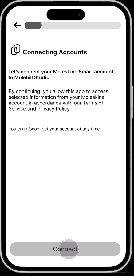
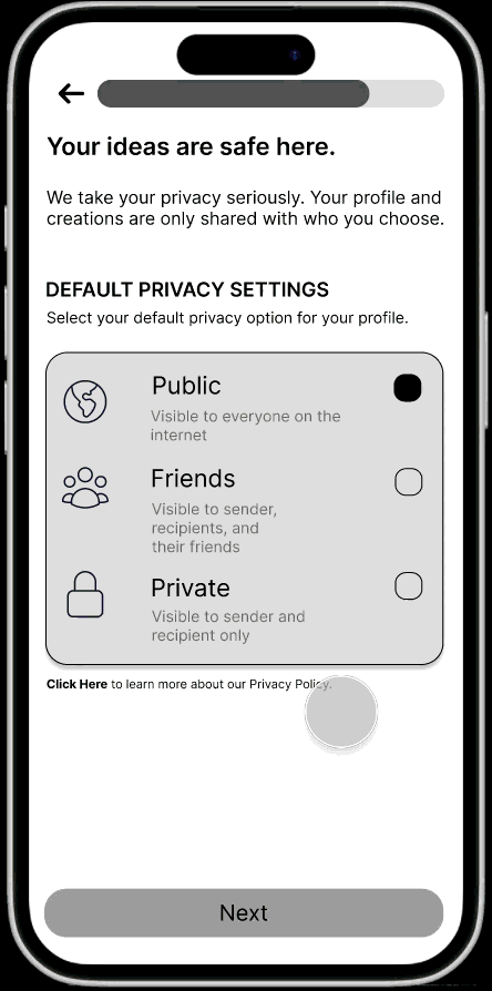
Asking users for information without being clear about what the information will be used for reinforces mistrust.
To remedy this, we worked on adding clear descriptions on each frame with clear action items.
Patience is low when going through mobile onboarding.
We made most frames skippable so that the user had the option to come back after onboarding.
Developing our Figma prototypes using Figma Make put our AI Training skills to the test.
AI is just a tool and can’t read your mind.
Figma Make was useful to visualize what certain ideas would look like without having to spend hours prototyping them ourselves.
For example, we picked a color palette and applied it to the design using FM in minutes.
We used that to decide to try to move our colors around and see what combination was best.
AI may make the design look pretty, but is it the most practical?
AI design often reflects generic layout patterns.
For example, on our feed frame, Figma Make defaulted to creating content cards very similar to Instagram’s feed.
We made the decision during our Mid-Fi prototype to have the content cards resemble the pages in the user’s notebook.
But it didn’t translate!
My key takeaways
Test early, test often!
User testing will tell us all we need to know if we LET IT and stop trying to perfect everything.
Flexibility takes you a long way
This project reminded me that working in a team requires flexibility- with your ideas, time, etc.
Everyone has the shared goal of producing a prototype, but everyone has their flair and strengths.
With open communication throughout, we were all able to hop around to the many moving parts and contribute meaningfully.